What Is Color Psychology? Color psychology is the study of how different colours affect human mood and behaviour. It explores how colors can influence emotional responses, as well as how responses to color are affected by factors such as age and cultural background and many more. The study on colour and its impact, influence on our daily personal and professional life cannot be summarised in just one documentation or with few representation with images. It is deeply imbibed into our system and how we react to it, is still a mystery. Many artists, psychologists, therapists and intellectuals have worked and have been working to understand what and how colour influences everything around us. Well, with this study of mine, I have tried to breakdown the understanding in simple ways.

INTRODUCTION
Do you feel anxious in a yellow room? Does the colour blue make you feel calm and relaxed? Artists and interior designers have long believed that colour can dramatically affect moods, feelings, and emotions. “Colour, like features, follow the changes of the emotions”, the artist Pablo Picasso once remarked.
Colour is a powerful communication tool and can be used to signal action, influence mood, and even influence psychological reactions. Certain colours have been associated with increased blood pressure, increase metabolism and eyestrain.
So how exactly how does colour work? How is colour believed to impact mood and behaviour? Why is colour such a powerful force in our lives? Warm colours evoke emotions ranging from feelings to warmth and comfort to feelings of anger and hostility. Colours on the blue side of the spectrum are known as cool colours and include blue, purple, and green.
Colour psychology is the study of hues as a determinant of human behaviour. Colour influences perceptions that are not obvious such as the taste of food. Colours can also enhance the effectiveness of placebos. For example, red or orange pills are generally used as stimulants. Colour can indeed influence a person; however, it is important to remember that these effects differ from person to person. Factors such as gender, age and culture can influence how an individua perceived colour. For instance, heterosexual men tend to report that red outfits enhance female attractiveness, whole heterosexual females deny outfit colour impacting that of men.
WHAT IS COLOUR PSYCHOLOGY
The psychology of colour is based on the mental and emotional effects colours have on sighted people in all facets of life. There are some very subjective pieces to colour psychology as well as soe more accepted and proven elements. We should keep in mind, that there will also be variations in interpretations, meaning, and perception between different cultures.
In 1966, an English scientist, Sir Isaac Newton discovered that when pure white light passes through a prism, it separates into all the visible colours. Sir Newton also found that each colour is made up of a single wavelength and cannot be separated any further into other colours.


Further experiments demonstrated that light could be combined to form other colours. For example, red light mixed with yellow light creates orange colour. Some colours, such as green magenta cancel each other out when mixed and result in a white light.

If you have ever painted, then you have probably noticed how certain colours can be mixed to create other colours.
Researchers Andrew Elliot & Markus Mair noted, “Given the prevalence of colour, one would expect colour psychology to be a well-developed area”. “Surprisingly, little theoretical or empirical work has been conducted to date on colours influence on psychological functioning, and the work that has been done has been driven mostly by practical concerns, not scientific rigor.”

Despite the general lack of research in this area, the concept of colour psychology has become a hot topic in marketing, art, design and other areas. Much of the evidence in this emerging area is anecdotal at best, but researchers and experts have made a few important discoveries and observations about the psychology of colour and the effect it has on moods, feelings and behaviours.
HISTORY OF COLOUR PSYCHOLOGY
As early as 2000 BC colour was being used as a treatment method for centuries before colour psychology existed or was understood. The ancient Egyptians documented colour “cures” using painted rooms or sunlight shining through crystals as therapy. One of the earliest medical documents, the Nei Ching, documents colour diagnoses associated with colour healing practices.


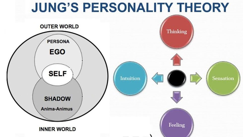
Carl Jung is most prominently associated with the pioneering stages of colour psychology. He was most interested in colours’ properties and meanings, as well as arts potential as a tool for psychotherapy. His studies in and writing on colour symbolism cover a broad range of topics, from mandates to the works of Picasso to the near-universal sovereignty of the colour gold – the lattermost of which, according to Charles A Riley II, “expressed the apex of spirituality and intuition.” In pursuing his studies of colour usage and effects across cultures and time periods, as well as examining his patients’ self-created mandalas, Jung attempted to unlock and develop a language or code (if you may) the ciphers of which would be colours. He looked alchemy to further his understanding of the secret language of colour, finding the key to his research in alchemical transmutation. His work has historically provided information to the modern field of colour psychology.

MODEL OF COLOUR PSYCHOLOGY
The general model of colour psychology relies on six basic principles:
ü Colour can carry a specific meaning
ü Colour meaning is either based in learned meaning or biologically innate meaning.
ü The perception of a colour causes evaluation automatically by the person perceiving.
ü The evaluation process forces colour-motivated behaviour.
ü Colour usually exerts its influence automatically.
ü Colour meaning and effect has to do with context as well.
Influence of Colour on Perception:
Perception that are not obviously related to colour, such as the palatability of food, may in fact be partially determined by colour. Not only the colour of the food itself but also that of everything in the eater’s field if vision can affect this. For example, in food stores, bread is normally sold in packaging decorated or tinted with golden or brown tones to promote the idea of home baked and oven freshness.
Placebo effect:
The colour of placebo pills is reported to be a factor in their effectiveness with “hot-coloured” pills working better as stimulants and “cool-coloured” pills working better s depressants. This relationship is believed to be a consequence of the patient’s expectations and not a direct effect of the colour itself. Consequently, these effects appear to be culture dependent.
Blue public lightning:
In 2000, Glasgow installed blue street lighting in certain neighbourhoods and subsequently reported the anecdotal findings of reduced crime in these areas. This report was picked up by several news outlets. A railroad company in Japan installed blue lighting on its stations in October 2009 in an effort to reduce the number of suicide attempts, although the effect of this technique has been questioned.
There are also commonly noted psychological effects of colour as it relates to two main categories: Warm and Cool Colours. Warm colours such as – red, yellow, orange can speak a variety of emotions ranging from comfort and warmth to hostility as anger. Cool colours such as: green, blue and purple often speak feelings of calmness as well as sadness.
Hence the concepts of colour psychology are very relevant to how it effects our everyday life. For example, if one is planning on re-painting the walls or redecorating a house or room with a new colour scheme. Well, they might want to consider some of suggestions about colours and how they might affect our emotions and mood.

Psychological Effects of Cool Colours:
Let’s try utilizing the colour purple. Purple utilises both red and blue to provide a nice balance between stimulation and serenity that is supposed to encourage creativity. Light purple is said to result in a peaceful surrounding, thus relieving tension. These could be great colours for a home or business office.
Let’s now consider using green and/or blue. These cool colours are typically considered restful logic applied to this – because the eye focuses the colour green directly on the retina, it is said to be less strainful on your eye muscles.
The colour blue is suggested for high-traffic rooms or rooms that one or other people will send significant amount of time. Blue is typically a calming respiration and lower blood pressure. The bedroom is a great place to use these colours as they should help one relax.
Psychological Effects of Warm Colours:
When we want to create an environment of simulation or whet people’s appetite, Warm colours often play its role. Consider utilising the colours yellow or orange, these colours are often associated with food and can cause our tummy r=to growl a little. As anyone ever wondered why so many restaurants use these colours? Now, its clear and understood and even after watching the movie “SuperSize Me” people said, they were hungry.
One definitely should be careful using bright colours like orange and especially yellow. They reflect lighter and excessively stimulate a person’s eyes which can lead to irritation. One also probably does not want to paint the dining room or kitchen with these colours if one is calorie counter.
Psychology of Colour for Marketing and Advertising:
Marketing Colour psychology is also widely used in marketing and advertising and branding. Many marketers see colour as an important part of marketing because colour can be used to influence consumers’ emotions and perceptions of goods and services. Companies also use colour when deciding on brand logos. These logos seem to attract more customers when the colour of the brand logo matches the personality of the goods and/or services. For example, Pink being heavily used on Victoria’s Secret branding. Colours are also important for window displays in stores. Research shows that warm colours tend to attract spontaneous purchasers, despite cooler colours being more favourable.
PSYCHOLOGY OF COLOUR IN THERAPY

Several ancient cultures, including the Egyptians and Chinese, practiced chromotherapy, or the use of colours to heal. Chromotherapy is sometimes referred to as light therapy or colorology and is still used today as a holistic or alternative treatment.
Did you know our surroundings may be influencing our emotions and state of mind? Do you ever notice that certain places especially irritate us? Or that certain places are especially relaxing and calming? Well, there’s good chance that the colours in those spaces are playing a part.
In art therapy, colour is often associated with a person’s emotions. Colour may also influence a person’s mental or physical state. For example, studies have shown that some people looking at the red colour resulted in an increased heart rate, which the led to additional adrenaline being pumped into blood stream.
There are also commonly noted psychological effects of colours it relates to two main categories: Warm and Cool. Warm colours – such s red, yellow and orange – can speak a variety of emotions ranging from comfort and warmth to hostility and anger. Cool colours – such as green, blue and purple – often spark feelings of calmness as well as sadness.

Modern Research on colour psychology:
Most psychologists view colour therapy with scepticism and point out that the supposed effects of colour are often grossly exaggerated. Colours also have different meanings in different cultures.
However, existing research has found that colour can impact people in variety of surprising ways.
One study found that warm-coloured placebo pills were reported as more effective than cool-coloured placebo pills.
Anecdotal evidence has suggested that installing blue-coloured streetlights can lead to reduce crime in areas.
More recently, researchers discovered that the colour red causes people to react with greater speed and force, something that might prove useful during athletic activities.
A study that looked at historical data, found that sports team dressed in mostly black uniforms are more likely to receive penalties and that students were more likely to associate negative qualities with a player wearing a black uniform.
APPLICATION OF COLOUR PSYCHOLOGY IN EVERYDAY LIFE
Light, colour and surrounding:
Light and colour can influence how people perceive the area around them. Different light sources affect how colours of walls and other object are seen. Specific hues of colours seen under natural sunlight may vary when seen under the light from an incandescent light bulb: lighter colours may appear even darker. Light and the colour of an object can affect how one perceives its positioning. If light or shadow, or the colour f the object, masks an object’s true contour (outline of a figure), it can appear to be shaped differently from reality. Objects under a uniform light source will promote better impression f three-dimensional shape. The colour of an object may affect whether it seems to be in motion. In particular, the trajectories of objects under a light source whose intensity varies with space are more difficult to determine than identical objects under a uniform light source. This could possibly be interpreted as interference between motion and colour perception, both of which are more difficult under variable lighting.

Colour and Time Perception:
Recent results showed that the perceived duration of a red screen was longer than that of a blue screen. The results reflected sex differences; men but not women, overestimated the duration of the red screen were faster than those to blue screen. Participants who reacted quickly to a red screen overestimated its duration. In a demo with 150 people chosen at random, it was found that inside a pod bathed in blue colour the average perceived duration of a minute was 11 (eleven) seconds shorter than in a pod bathed in red colour.
Colour Preferences and associations between colour and mood.
Colour has long been used to create feelings of coziness or spaciousness. However, how people are affected by different colour stimuli varies from person to person.
Blue is the top choice for 35% of Americans, followed by green (16%), purple (10%) and red (9%).
A preference for blue and green may be due to a preference for certain habitats that were beneficial in the ancestral environment as explained inn the evolutionary aesthetics articles.
There is evidence that colour preferences may depend on ambient temperature. People who are cold prefer warm colours like red and yellow while people who are hot people cool colours like blue and green.
Some research has concluded that women and in respectively prefer “warm” and “cool” colours.
A few studies have shown that cultural background has a strong influence on colour preferences. Also, one region may have different preferences than another region (i.e. a different country or a different area of the same country), regardless of race.
Children’s preferences for colours: They find that colour can affect mood. However, these studies do not agree on precisely which moods are brought out by which colour.
Colour Influence on Performance:
Studies have also shown that certain colours can have an impact on performances. No one likes to see a graded test covered in red ink, but one study found that seeing the colour red before taking an exam hurt test performance.
While the colour red is often described is threatening, arousing or exciting, many previous studies on the impact of the colour red have been largely inconclusive. The study found, however, that exposing students to the colour red prior to an exam has been shown to have a negative on test performance.
COMMON PSYCHOLOGY EFFECTS OF COLOURS
The following are some common psychological effects of colours. Let’s keep in mind that certain shades or tones may result in very different meanings. Also, the context around the colour and even surrounding colours can have an effect.
A study by psychologist Andrew J Elliot tested to see if the colour of a person’s clothing could make the appear more sexually appealing. He found that, to heterosexual men, women dressed in the colour red were significantly more likely to attract romantic attention than women in any other colour. The colour did not affect heterosexual women’s assessment on other women’s attractiveness. Other studies have shown a preference for men dressed in red among heterosexual women.
Common associations connecting colour to a particular mood may differ cross-culturally. For instance, one study examined colour associations and moods using participants and moods from Germany, Mexico, Poland, Russia and the United States. The researchers did find some consistencies, including the fact that all nations associated red and black with both angers. However, only Poles associated purple with both anger and jealousy and only Germans associated highlight with culture influencers people’s perceptions of colour and colours’ relationship to mood.
Despite cross-cultural differences regarding the ‘meanings’ of different colours, one study revealed that there were cross-cultural similarities regarding which emotional states people associated with particular colours. For example, the colour red was perceived as strong and active.

Psychological Properties of Colours:
There are 4 psychological primary colours – Red, Blue, Yellow and Green. They relate respectively to the body, the mind, the emotions and the essential balance between these 3. The psychological properties f the 11 basic colours:
RED: PHYSICAL
POSITIVE: Physical courage, strength, warmth, energy, basic survival, 'fight or flight', stimulation, masculinity, excitement
NEGATIVE: defiance, aggression, visual impact, strain
UNDERSTANDING: Being the longest wavelength, red is a powerful colour. Although not technically the most visible, it has the property of appearing to be nearer than it is and therefore it grabs our attention first. Hence, its effectiveness in traffic lights the world over. its effect is physical, it stimulates us and raises the pulse rate, giving the impression that time is passing faster than it is. pure red is the simplest colour with no subtlety. It is stimulating and lively, very friendly. at the same time, it can be perceived as demanding and aggressive.
BLUE: INTELLECTUAL
POSITIVE: Intelligence, communication, trust, efficiency, serenity, duty, logic, coolness, reflection, calm.
NEGATIVE: Coldness, aloofness, lack of emotions, unfriendliness.
UNDERTANDING: Blue is the colour of the mind and is essentially soothing, it affects us mentally, rather than the physical reaction we have to red. Strong blue will stimulate clear the mind and aid concentration. Consequently, it is serene and mentally calming. It is the colour of clear communication. Blue objects do not appear to be as close to us as red ones. Time and again in research, blue is the world’s favourite colour. However, it can be perceived as cold, unemotional and unfriendly.
YELLOW: EMOTIONAL
POSITIVE: Optimism, confidence, self-esteem, extraversion, emotional strength, friendliness, creativity.
NEGATIVE: Irrationality, fear, emotional, fragility, depression, anxiety, suicide.
UNDERSTANDING: The yellow wavelength is relatively long and essentially stimulating. In this case the stimulus emotional, therefore yellow s the strongest colour, psychologically. The right yellow will lift your spirits and our self-esteem, it is the colour of confidence and optimism. Too much of it, or the wrong tone in relation to the other tones in a colour scheme, can cause self-esteem to plummet, giving rise to fear and anxiety. Our “yellow streak” can surface.
GREEN: BALANCE
POSITIVE: harmony, balance, refreshment, universal love, rest, restoration, reassurance, environmental, awareness, equilibrium, peace.
NEGATIVE: Boredom, stagnation, blandness, enervation.
UNDERSTANDING: Green strikes the eye in such a way as to require no adjustments whatever and is, therefore, restful. Being in the centre of the spectrum, it is the colour of balance – a more important concept than many people realise. When the world about us contains plenty of green, this indicates the presence of water, and little danger of famine, so we are reassured by green, to a primitive level. Negatively, it can indicate stagnation and, incorrectly used, will be perceived as being too bland.
VIOLET: SPIRITUAL
POSITIVE: Spiritual awareness, containment, vision, luxury, authenticity, truth, quality.
NEGATIVE: Introversion, decadence, suppression, inferiority.
UNDERSTANDING: The shortest wavelength is violet, often described as people. It takes awareness to a higher level of thought, even into the realms of spiritual values. It is highly introvertive and encourages deep contemplation or meditation. It has associations with royalty and usually communicates the finest possible quality. Being the last visible wavelength before the ultra-violet ray, it has associations with time and space and the cosmos. Excessive use of purple can bring but too much introspection something cheap and nasty faster than any other colour.
ORANGE
POSITIVE: Physical comfort, food, warmth, security, sensuality, passion, abundance, fun.
NEGATIVE: Deprivation, frustration, frivolity, immaturity.
UNDERSTANDING: Since it is a combination of red and yellow, orange s stimulating and reaction to it is a combination o the physical and the emotional. It focusses our minds on issues of physical comfort – food, warmth, shelter, etc – and sensuality. It is a ’fun’ colour. Negatively, it might focus on the exact opposite – deprivation. This is practically likely when warm orange is used with black. Equally, too much orange suggests frivolity and a lack of serious intellectual values.
PINK
POSITIVE: Physical tranquillity, nurture, warmth, femineity, love, sexuality, survival of the species.
NEGATIVE: Inhibition, emotional claustrophobia, emasculation, physical weakness.
UNDERSTANDING: Being a tint of red, pink also affects us physically, but it soothes, rather than stimulates. (Interestingly, red is the only colour that has an entirely separate name for its tints. Tints of blue, green, yellow, etc. are simply called light blue, light green, etc.). Pink is powerful colour, psychologically. It represents the feminine principle, and survival of the species, it is nurturing and physically soothing. Too much pink is physically draining and can be somewhat emasculating.
GREY/GRAY
POSITIVE: Psychological neutrality.
NEGATIVE: Lack of confidence, dampness, depression, hibernation, lack of energy.
UNDERSTANDING: Pure grey is the only colour that has no direct psychological properties. It is, however, quite suppressive. A virtual absence of colour is depressing and when the world turns grey, we are instinctively conditioned to draw in and prepare for hibernation. Unless the precise tone is right, grey has a dampening effect on other colours used with it. Heavy us of grey usually indicates a lack of confidence and fear of exposure.
BROWN:
POSITIVE: Seriousness, warmth, nature, earthiness, reliability, support.
NEGATIVE: Lack of humour, heaviness, lack of sophistication.
UNDERSTANDING: Brown usually consists of red and yellow, with a large percentage of black. Consequently, it has much of the same seriousness as black, but it is warmer and softer. It has elements of the red and yellow properties. Brown has associations with the earth and the natural properties find it quietly supportive – more positively than the ever-popular black, which is suppressive, rather than supportive.
BLACK
POSITIVE: Sophistication, glamour, security, emotional, safety, efficiency, substance.
NEGATIVE: Oppression, coldness, menace, heaviness.
UNDERSTADING: Black is all colours, totally, absorbed. The psychological implications of that are considerable. It creates protective barriers as it absorbs all energy coming towards you, and it enshrouds the personality. Black is essentially an absence of light, since no wavelengths are reflected and it can, therefore be menacing, many people are afraid of dark. Positively, it communicates absolute clarity, with no fine nuances. It communicates sophistication and uncompromising excellence, and it work particularly well with white. Black creates a perception of weight and seriousness.
WHITE
POSITIVE: Hygiene, sterility, clarity, purity, cleanness, simplicity, efficiency.
NEGATIVE: Sterility, coldness, barrier, unfriendliness, elitism.
UNDERTSANDING: Just as black is total absorption, so white s total reflection. In effect, it reflects the full force of the spectrum into our eyes. Thus, it also creates barriers, but differently from black, and it is often a strain to look at. It communicates, “touch me not!” White is purity and, like black, uncompromising, it is clean, hygiene, and sterile. The concept of sterility can also be negative. Visually, white gives a heightened perception of space. The negative effect white on warm colours is to make them look and feel garish.

In conclusion let’s have a look at the general model:
a. Colour can carry a specific meaning.
b. Colour meaning is either based in learned meaning r biologically innate meaning.
c. The perception of a colour cause evaluation automatically by the person perceiving.
d. The evaluation process forces colour-motivated behaviour.
e. Colour usually exerts its influence automatically.
f. Colour meaning and effect has to do with context as well.

ABOUT THE AUTHOR: Ms. Amrita Tiwary
Founder-CEO at Kreative Minds, Curator & Artist. She believes in promoting Indian Art & Culture across the globe. Her extensive background includes completing numerous courses in Art and Design, which has equipped her with a diverse skill set. In addition to her artistic pursuits, she plays a vital role as a mentor to aspiring artists worldwide, guiding them through their educational journeys in art and encouraging them to pursue their passions within the framework of their academic institutions. Amrita is committed to establishing Kreative Minds as a leading brand synonymous with all forms of art, including Fine Arts, Music, and Dance. She actively curates art exhibitions and organizes cultural events that celebrate Indian dance and music, with a strong belief in the importance of promoting Indian art and culture on a global scale. Through her efforts, she aims to create a vibrant community that appreciates and engages with the rich artistic heritage of India, inspiring future generations to embrace their creative potential.
Комментарии